


I would love your help on Tarro Branding Ideas
I've been thinking about rebranding Tarro Skincare to reflect what Tarro stands for.
So I wanted to share with you my mission for Tarro and its purpose
Your Skin, Your Choice, Your Glow
- Empower people to mindfully choose and take control of what goes on their skin, feeding the skin from the outside in
- Celebrate skincare freedom to explore natural ingredients both animal and plant-based
- Partner wih local farms to sustainably and ethically source organic grass-fed tallow and locally grown botanicals, ensuring purity and traceability and supporting British farming
As a valued subscriber, your perspective is important to me.
My new brand manager Jemma has put together a few design options and would love your help selecting the one that best reflects our brand identity.
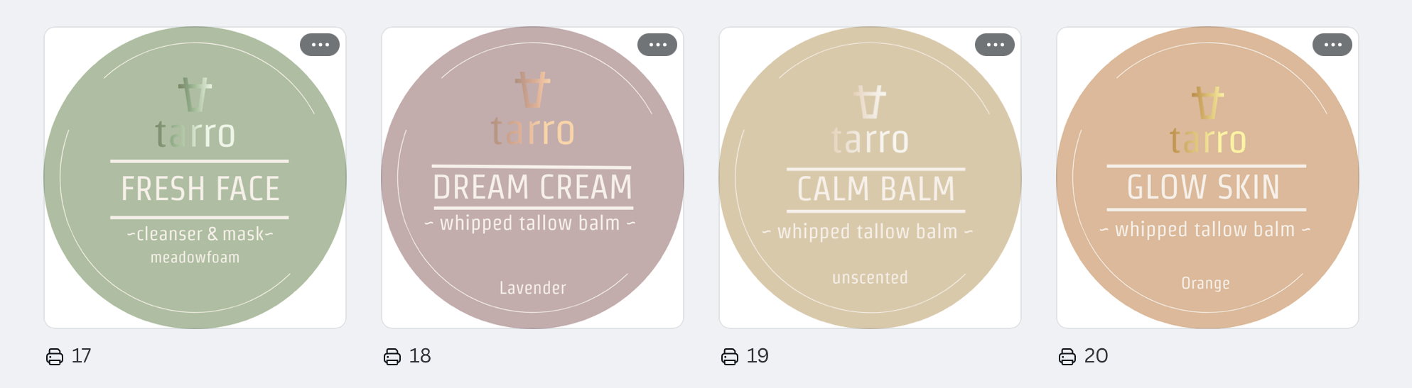
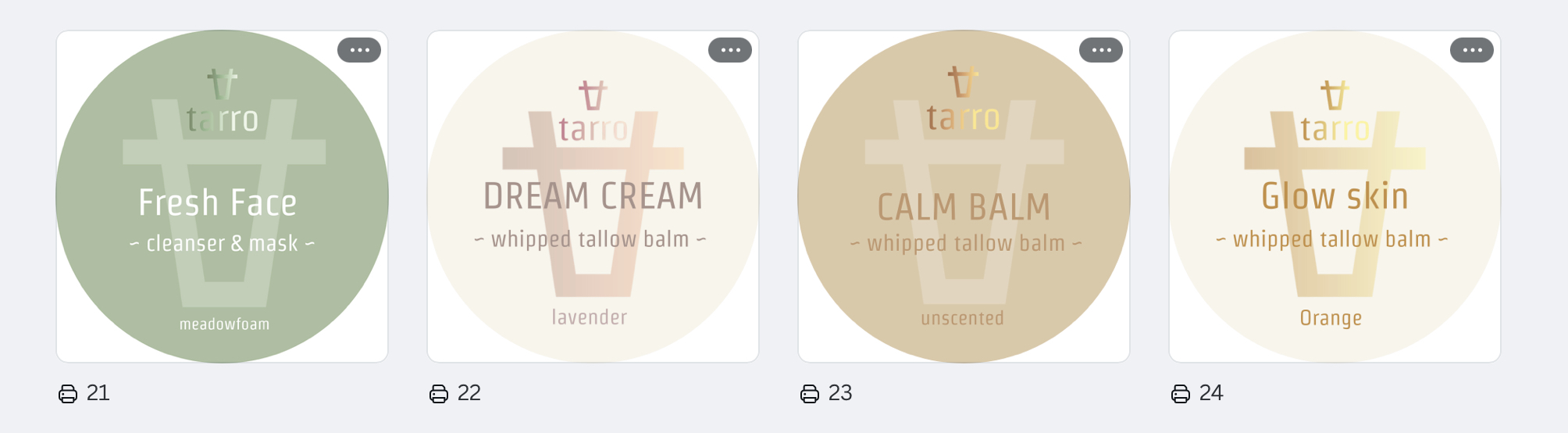
Below are the designs we have shortlisted.
My new brand manager Jemma has put together a few design options and would love your help selecting the one that best reflects our brand identity.
Below are the designs we have shortlisted.
- What is your opinion of this rebranding vs current?
- Which style resonates with you?
- What impression does each row give to you as a customer?
Any feedback on colourways, font, readability, style would be really appreciated!
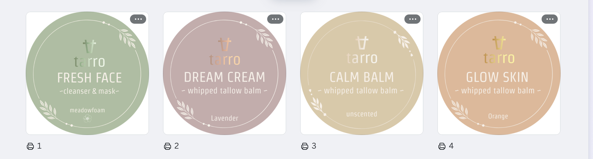
Row 1
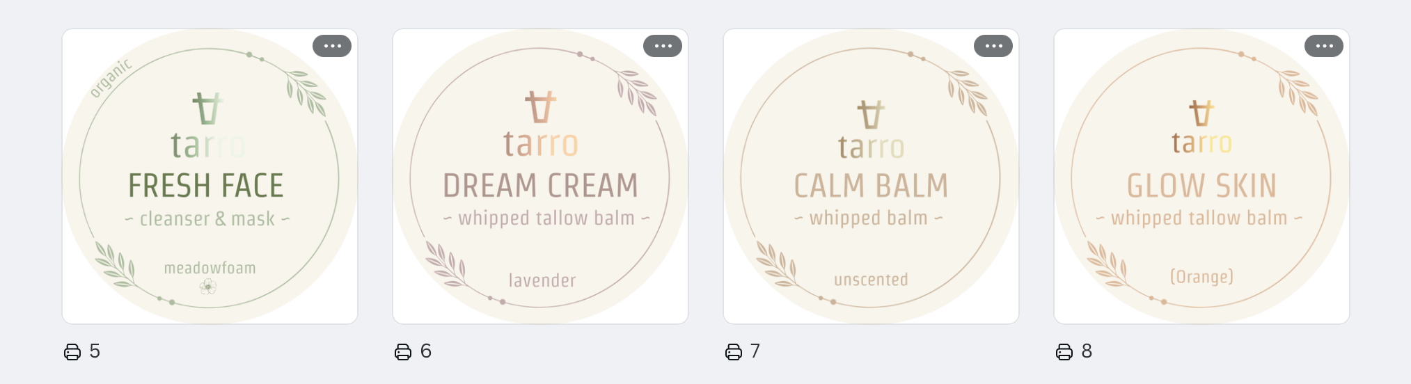
Row 2
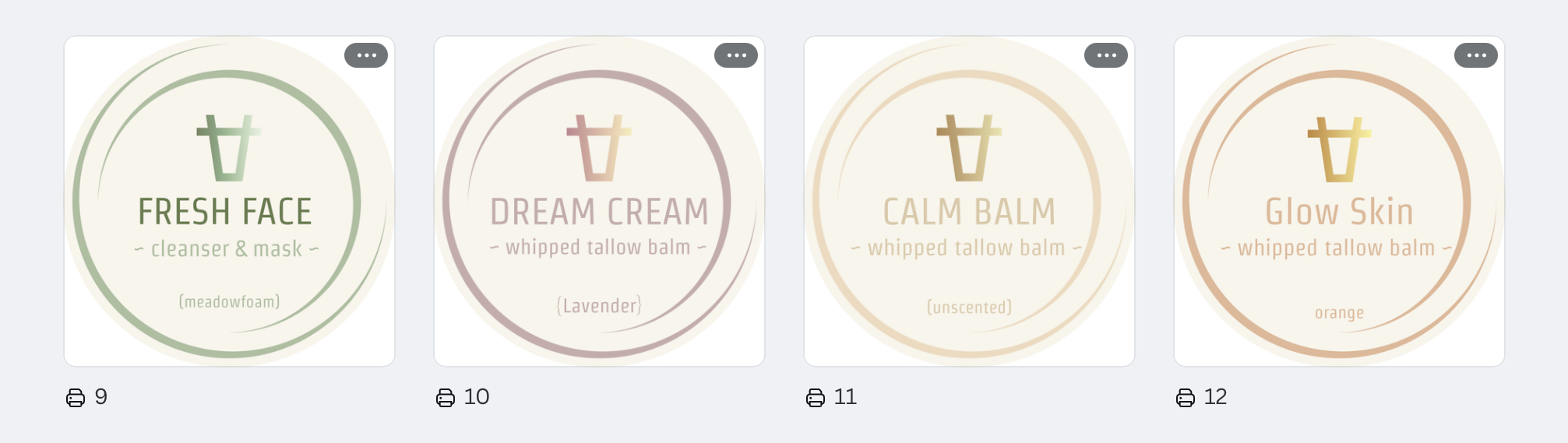
Row 3
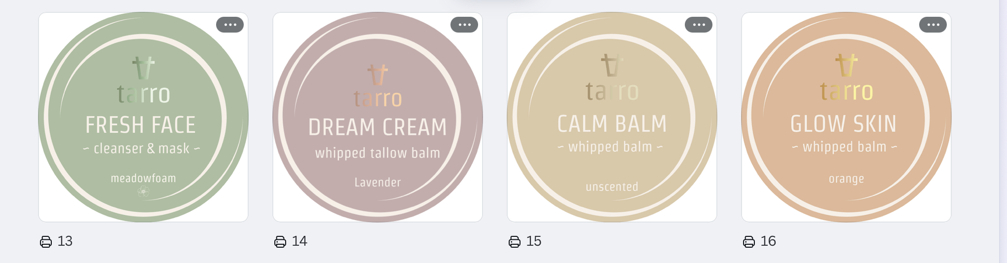
Row 4
Row 5
Row 6
Current Branding

Share:
5 comments
-
I like the solid colour of 1 & 3, v obvious way to distinguish between them. I prefer the simpler designs overall with less text like row 4. In row one perhaps just one bunch of foliage to simplify the design? Overall my favourites are 1,3 & 4
Jennifer Espley on
-
Love row 1 as like the idea of colours representing the different uses for the balms.
Rhian on
-
I think Row 1 looks distinctive. The pastel colours look unique & great, just distinguish the different colours a little more to highlight individual products.
Thomas on
-
Row 1 or 4
I think a slightly different colour for each team helps to quickly identify which one you are picking up.
I prefer a slightly more subtle nod to the cow shape!! You have to be on board but it isn’t necessarily what I want to think about when I pick up the creams!Karen on
-
Row 4 – simple clear whilst having enough difference
Lydia Beard on


